9.1 Graphing in base R
Data visualization is a notable strength of R, and its native (base) capabilities allow you to create high quality, straightforward graphs.
9.1.1 Describe one variable
Summarizing briefly what we presented in prior chapters, presenting data on a single variable is primarily a matter of understanding what type of measure you have. Using the dcps data:
# Histogram (numeric X)
  hist(dcps$NumTested)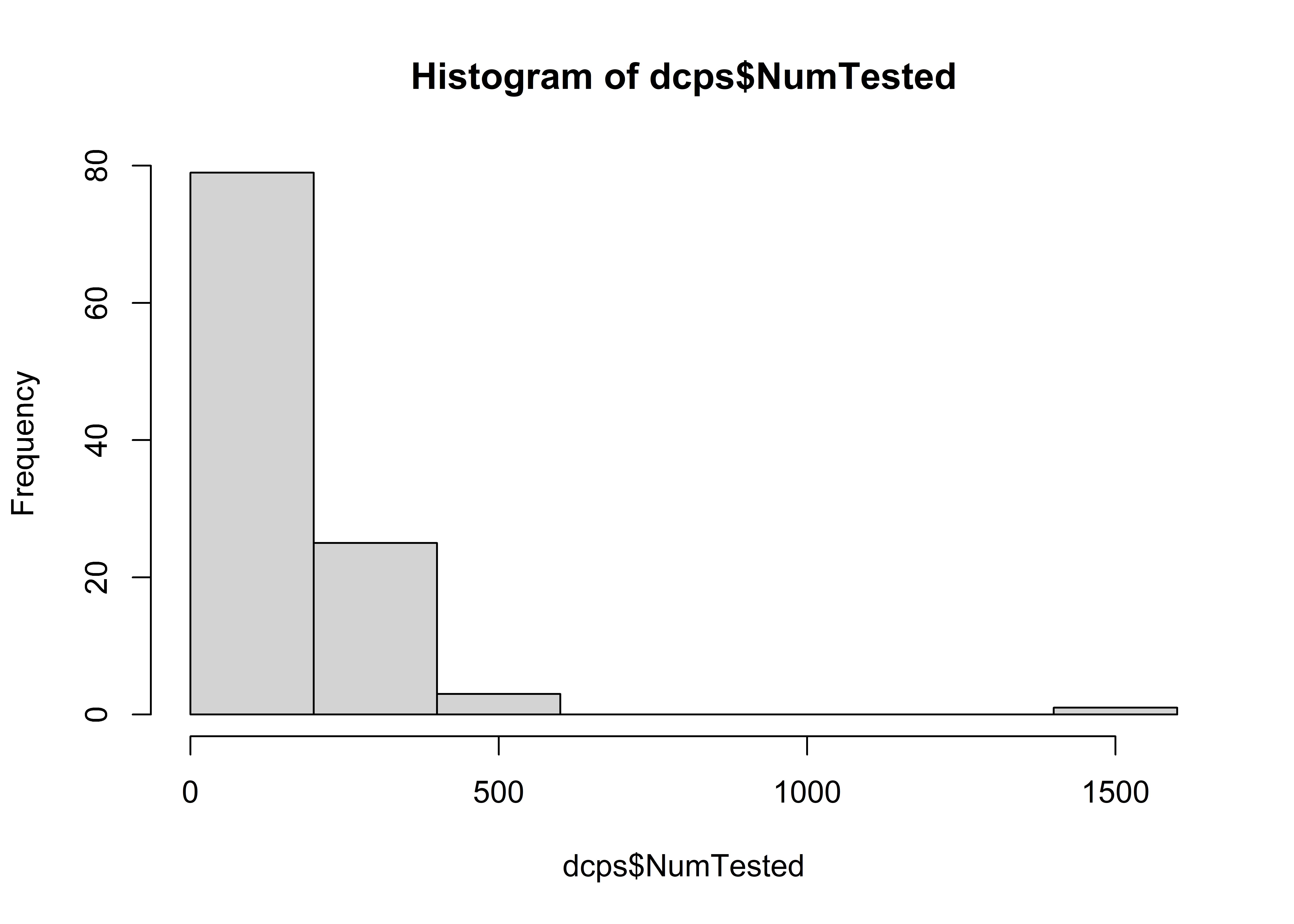
# Boxplot (numeric X)
  boxplot(dcps$ProfMath, horizontal = TRUE)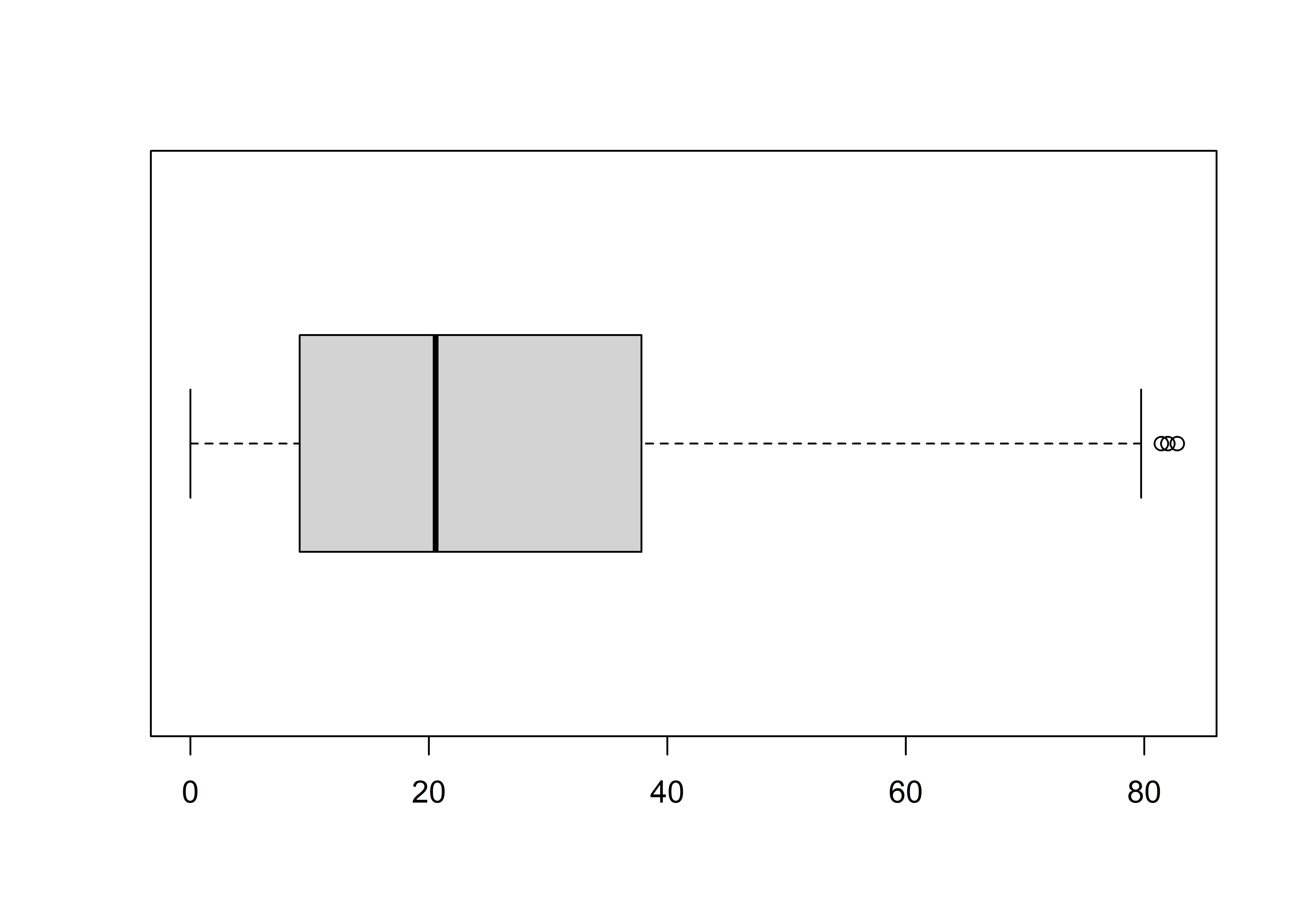
# Bar plot (nominal X)
  # 1. relative frequency table
    tab =
      dcps %>%
      count(SchType) %>%
      mutate(Percent = 100 * n/sum(n))

  # 2. barplot from table
    barplot(Percent ~ SchType, data = tab)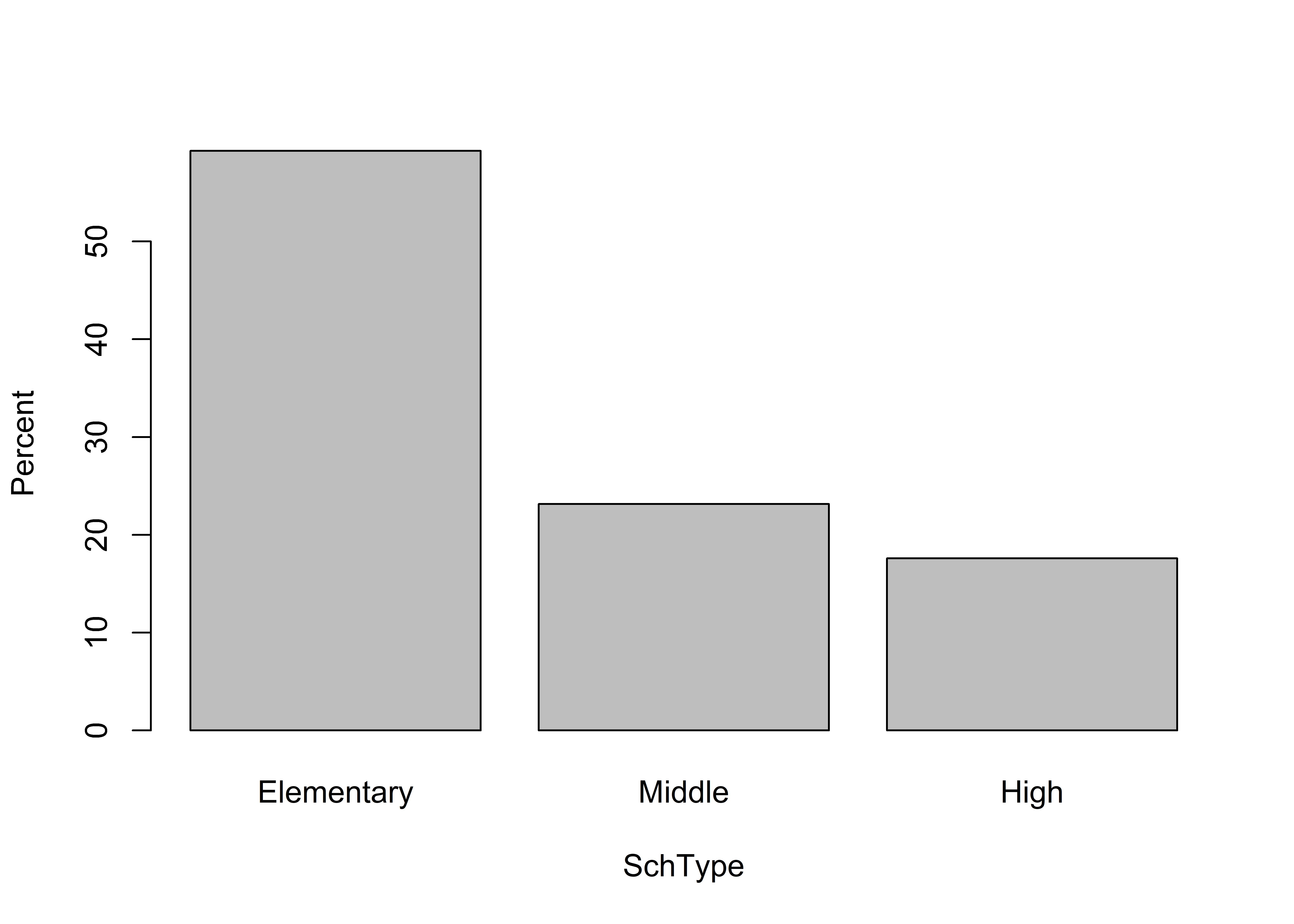
9.1.2 Visualizing relationships
For visualizing relationships between variables:
# Group comparison (nominal X, numeric Y)
  boxplot(NumTested ~ SchType, data = dcps)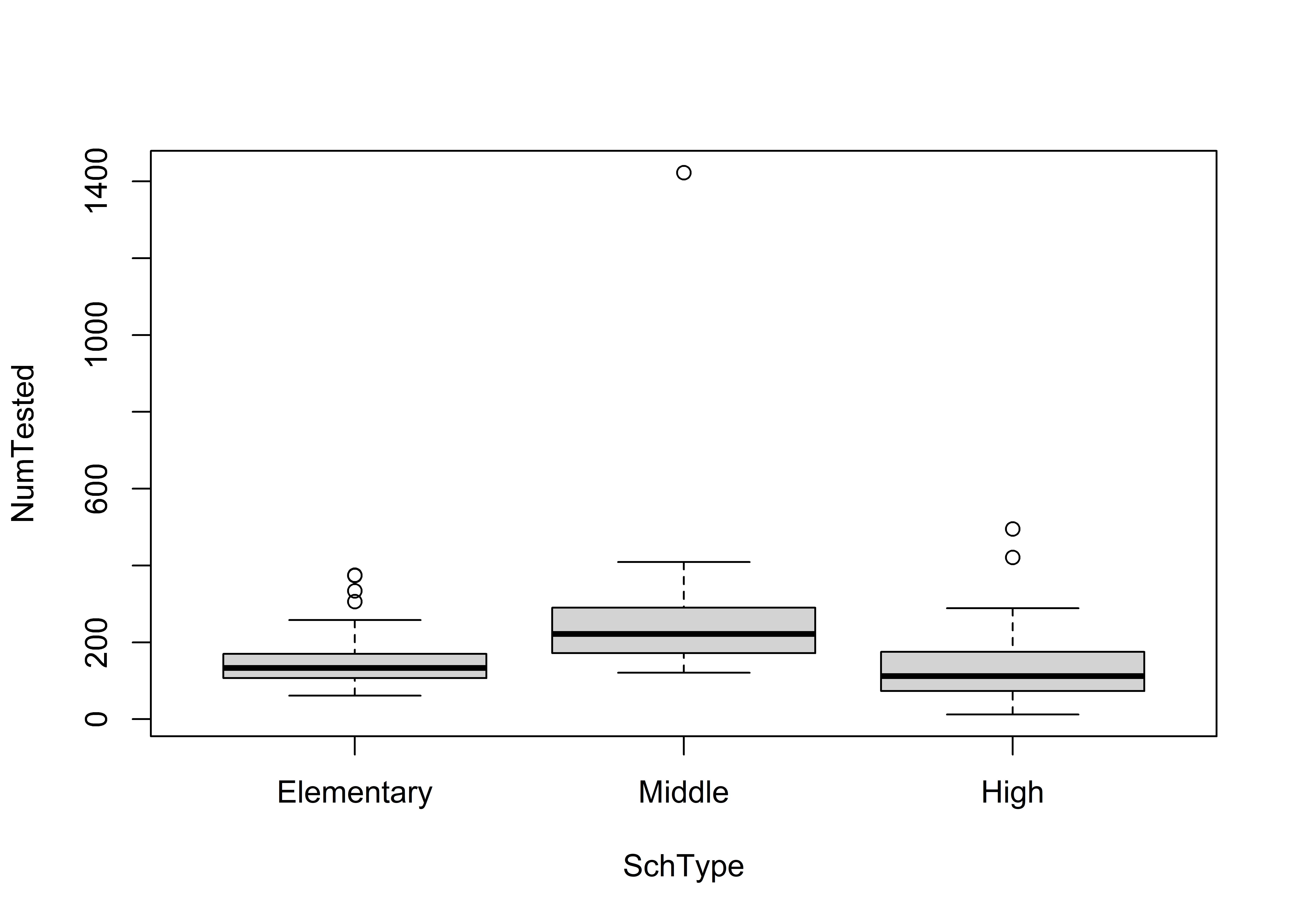
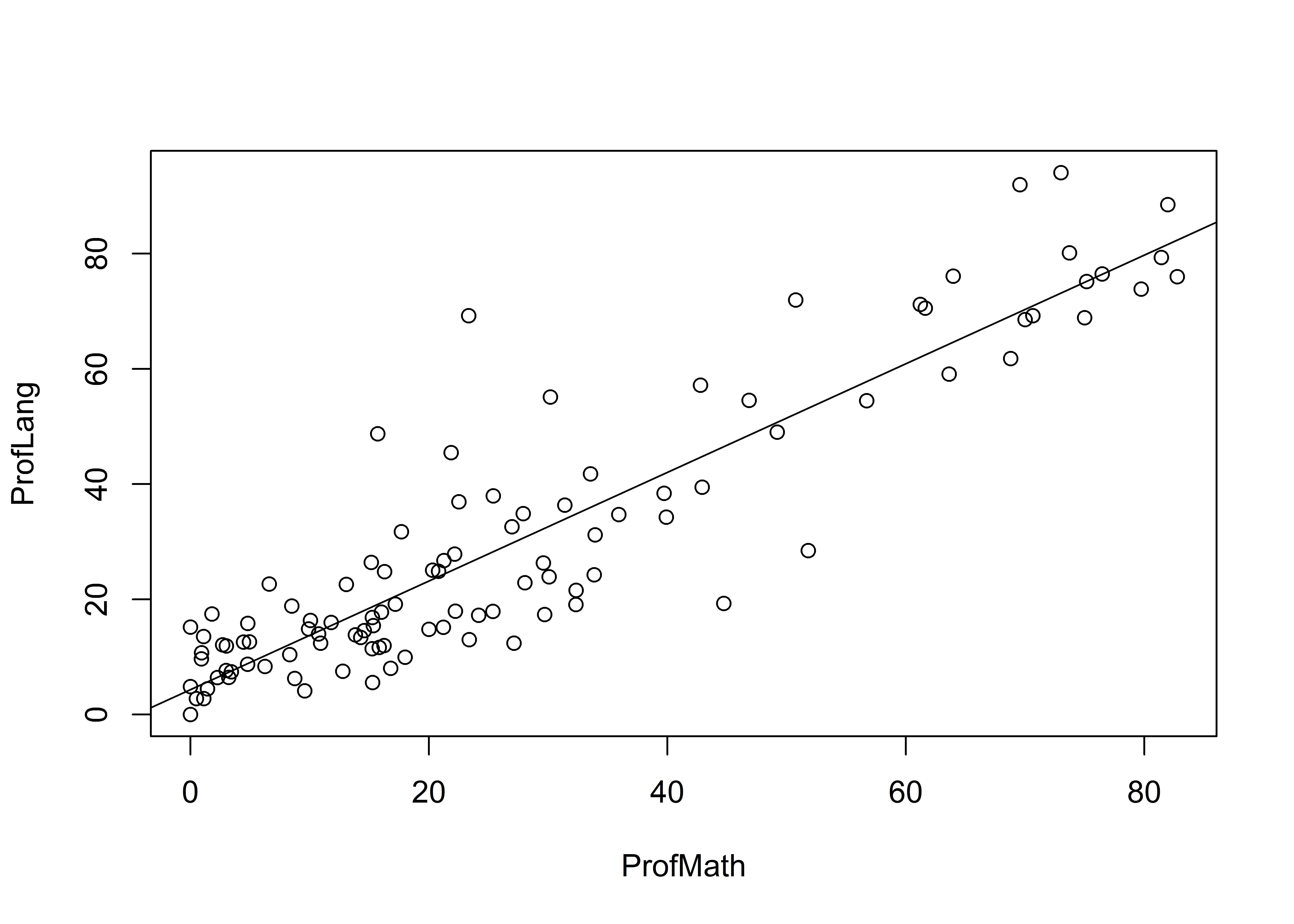
# Scatter w/OLS fit (numeric X, numeric Y)
  # 1. store OLS estimates
    est = lm(ProfLang ~ ProfMath, data = dcps)
  # 2. plot
    plot(ProfLang ~ ProfMath, data = dcps) # scatter
    abline(est) # add linear fit